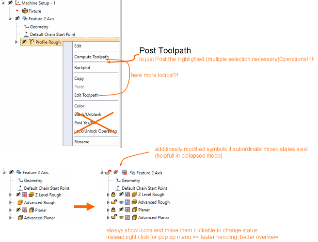
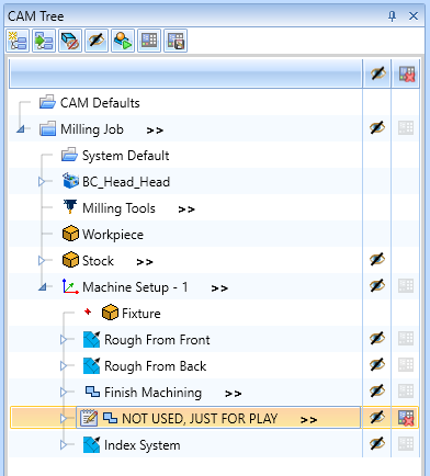
I could not agree more that the “blank/unblank” and “post yes/no” features have needed an upgrade for far too long. At this point I have gotten used to and know what I need to do to make it work the way i want to, but I’m always grumbling under my breath that while functional, I’m not sure it could have been implemented to take more steps than it does…
I would love to be able to do multiple select and turn on/off the blanking and posting, but even just make it so that the rightclick popup doesn’t disappear when you check/uncheck the option, and give us an indication which direction the toggle is set (have the text say “Blank” if it is unblanked, and “Unblank” if is is blanked).
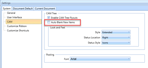
In regards to the toolpath blanking as a default, I would vote whole heartedly against this as the hardcoded default. I understand some people would rather have them blanked, but I think it risks too much in not seeing the toolpath that was just generated and I would then be forced to 100% of the time turn it back on. I like the idea of making it an option though :). I would put this request far below and serially after fixing the toggles discussed above.
Thanks for the discussion!


