Hello Alex,
following @MpVpRb message and your demand I’ve written down a few things about how I see and experience the BC-CAM documentation.
1
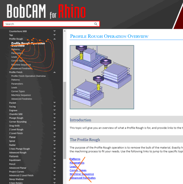
Selecting another section, the navigation menu gets always reloaded.
This makes it difficult to keep the focus on the actual content. Especially because the content is always displayed earlier than the reloaded navigation.
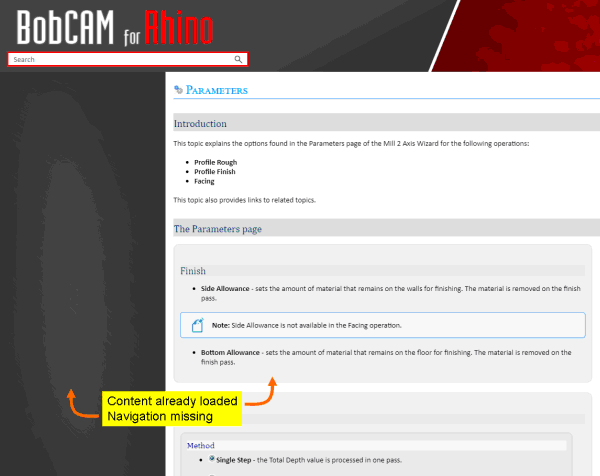
The navigation should remain “static”
2
As I write these lines, I’ve been going through pretty much all the navigations. Just to be sure…
Very very few pictures, but tons of text which slays the reader.
Urgent appeal: “A picture says more than a thousand words!” => Introduce each section with those images, user will see when using the software. Based on those images, explain the details. It is very hard to read just text and get the idea, what you are referring/meaning.
Use annotations to refer to them in the explanations.
3
Kick off the annoying ‘Introduction part’
“This topic will explain the , and will provide links to related topics.”
This to me is completely needless. What else of information should be explained as those being selected in the navigation and/or displayed in the header?
Leave it alone and concentrate on the essentials.
4
Explanations for operations are separated on a lot of pages. Merge all pages so that back and forth loading is not necessary.
It is much easier to have everything on one page, especially because you can quickly look between previous/following sections.
5
And (again): explain things with pictures, as the software shows itself to the user!
6
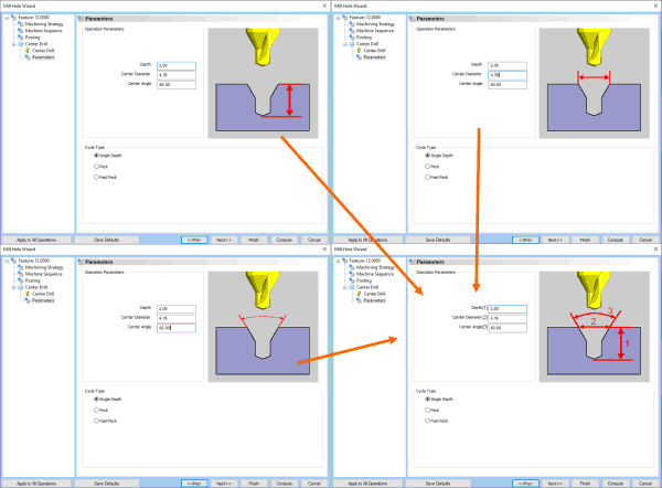
Instead of explaining details with text only, bring self explaining pictures into the game.
Sometimes (and unfortunately only sometimes) a corresponding image is displayed when a parameter is selected in the GUI. And then strangely enough, many of the GUI images have a different representation than those in the documentation => also somewhat misleading.
7
Disappointing: often parameters are simply not listed and thus not explained (e.g. ‘Profile Rough’ - ‘Patterns’: Method ‘Zig’/‘Zig Zag’ when using ‘Side Roughing’; Linking: ‘Direct’/‘S-Link’).
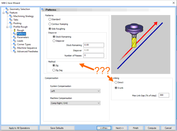
Even self-evident things need to be explained. In the end, everyone has a different approach how systems are understood and used.
8
Within the GUI, I would very much like to see things presented more clearly and explained more naturally. This would save a lot of interpretation, consideration and looking up in the online documentation.
-
introduce tooltips wherever possible (headers, parameters, sections) that give a short explanation what to do here
-
wherever values are to be entered with a unit (%, mm, m/s, …), tell the user which unit is to use. There is enough space in the dialogs than having to save in the wrong place here.
-
reduce separate picture information if close together to reduce flicker of images.
-
uses more self-explanatory images and enriches them with hints for every parameter (like in the previous point for ‘Depth’, ‘Center Diameter’ and ‘Center Angle’), so that the user knows which parameter affects what.
Bye, Harald