Logial structure/Icons in popup menu

Hi,

The logical structure needs an improvement. For example:

Frequently used actions that are called up on all pop-up menus should be kept in the same position and given at the beginning. It is tedious to always have to search for the position where the action is located.

Another hint: icons are a great help to find things quickly.

Would be nice to get an improvement to this.

Bye, Harald

2 Likes

Agree with this, definitely needs improvement.

Hi,

just to bring this topic to mind and hopefully it will work out in V36 :wink:

Bye, Harald

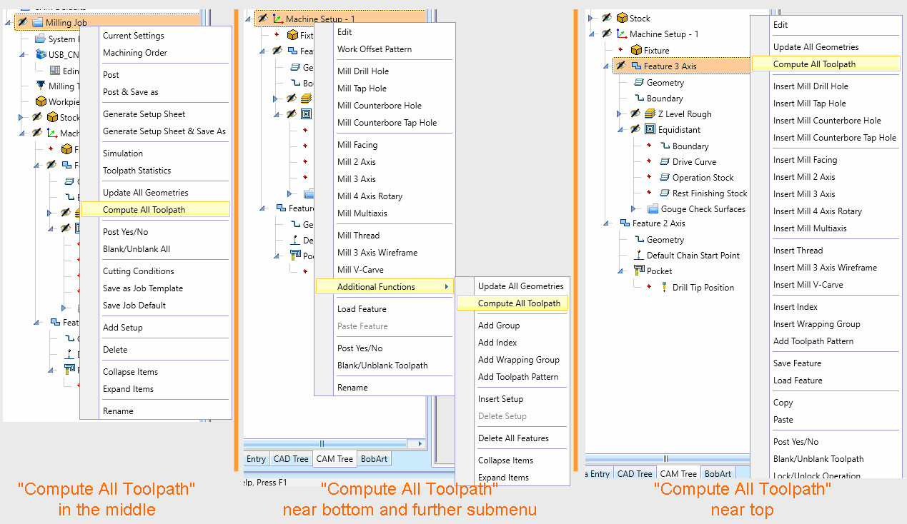
My understanding about “Compute All Toolpath” is that it is not meant to be one that is used all the time. Using this will recompute all toolpath in the whole job instead of just one toolpath.

This can fine for smaller jobs, but not others where let’s say it is a Mold and you are using Equidistant toolpath with a small stepover which takes much longer to use.

The idea is not to use it very often.

Whenever you move an item towards the top, this means other valuable functions that other users need are lower down the list. When you are under “Milling Job”, it makes sense that Current Settings and Post are at the top. When using “Machine Setup”, it makes sense “Edit” and “Work Offset Pattern” are at the top.

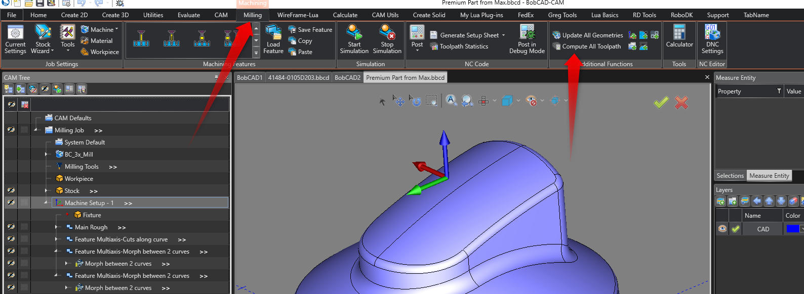
Also, note that this it is easy to use “Compute All Toolpath” by going to the “CAM” tab > “Compute All Toolpath”. Then, you don’t even have to Right-Click:

Hi Paul,
the initial post with focus on Toolpath was just an example. It may also reflect on Copy/Paste, Delete (which funnily enough is given on the larger Feature menu but not on smaller Operation menu), Blank/Unblank which is swapped with Post Yes/No, …
So there are a lot of confused arrangements that should be harmonized. At least and in any case, leading Icons to each command will sure also help out of this (a picture says more than 1000 words…)

If you take out actions that can be done via the CAM-Tree, I think no one gets angry on that, too if handling of menu gets improved.
Regards, Harald

1 Like

Looking at your example, I think you nay be missing the fact that the setting closer seem to be more pertinent to what you are selecting. For instance when right clicking the setup edit is way more useful then compute all toolpath. where when you right click on the feature compute toolpath is towards the top. If you are using the software day in and day out it actually saves mouse miles. Because computing all toolpath is a less common function when right clicking the machine setup of machining job. I know you used compute toolpath as an example, but if you look at the order it makes sense for what you are clicking on.

Hi @The_mtbiking_viking

yes, I thougt about that issue, too. But…
image

… it depends, for which operation/feature at which position you hit the right mouse. And as you see in the image above, it first needs some eyes miles to get the right action and then it often comes to mouse miles either.
I prefer to have all stayed the same instead always have to overload my eyes and brain to seach where I am.
And as stated before: if the actions gonna support with icons, all get sure already easier.

Bye, Harald

I see ya when you are towards the bottom and it goes up, but its consistent within what you are clicking on. I personally am not a fan of icons. I like the text personally and would be pretty frustrated if this got replaced with only icons as the tend to get smaller and harder to see, but maybe there is a way they can do both.

1 Like

Hi,
yeah… I always mean icons + text like below:
image

One look and you know where you are, pretty much no matter where the action is. In this example perfect also the given shortcuts, that at this point in BC are just a question of whether they are applicable…

Bye, Harald

1 Like

Just want to add that the workflow for quickly accessing menus in the CAM Tree for functions like Compute All Toolpath, etc… will be greatly improved through the use of our new Contextual Menu in V36!

Be on the look-out for the next version!

3 Likes